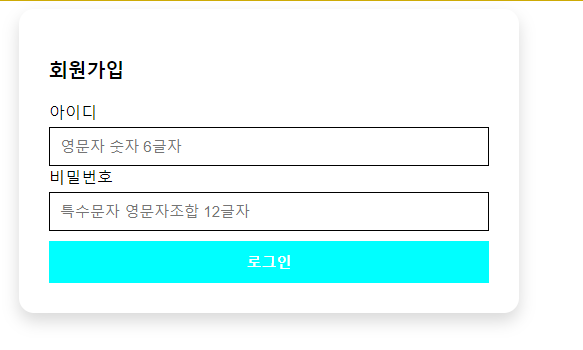
<!DOCTYPE html>
<html lang="en">
<head>
    <meta charset="UTF-8">
    <meta name="viewport" content="width=device-width, initial-scale=1.0">
    <title>Document</title>

    <style>
        .wrap{
            width:500px;
            margin: 0 auto;
            box-shadow: 0 8px 16px rgb(0, 0, 0, 0.15);
            padding: 30px;
            box-sizing: border-box;
            border-radius: 15px;
        }
        .input-box button{
            background-color: aqua;
            width: 100%;
            padding: 10px 0px;
            color: #fff;
            box-sizing: border-box;
            margin-top: 10px;
            border: none;
            font-weight: 900;
            font-size: 15px;

            transition: all 0.5s ease-in-out 0s; /*변경할속성 , 시간 , 타이밍펑션 , 딜레이*/

        }
        .input-box label{
            display:block;
            margin-top:5px;
        }
        .input-box input{
            display: block;
            width: 100%;
            padding:10px;
            font-size: 15px;
            box-sizing: border-box;
            border: 1px solid #000;
            margin-top: 5px;
        }
        .input-box input:focus {
            outline: none;
            border:1px solid green;

        }
        .input-box button:hover{
            background-color: red;
            /* width: 50%; */
        }
    </style>
</head>
<body>

    <div class="wrap">
        <h3>회원가입</h3>

        <div class="input-box">
            <label>아이디</label>
            <input type="text" placeholder="영문자 숫자 6글자" name="id">
        </div >
        <div class="input-box">
            <lable>비밀번호</lable>
            <input type="password" placeholder="특수문자 영문자조합 12글자" name="pw">
        <div>

        </div>

        <div class="input-box">
            <button type="button">로그인</button>
        </div>
    </div>
</body>
</html>
border에 그림자를 주고 0, 그 이후2배씩이 보기가 좋은 이 공식이다.
ex) 0 , 8 , 16 rgb( 0, 0, 0, 0.15)
ease-in-out
transition 애니메이션 효과로
(변경할 속성, 시간 , 타이밍함수 , 딜레이 순이다).
all , 0.5s , ease-in-out. 0.5s ~
'CSS > CSS 이론에따라 직접해보기' 카테고리의 다른 글
| 포지션 실습하기2 (0) | 2024.01.27 |
|---|---|
| 07포지션 (1) | 2024.01.27 |
| 레이아웃Float 실습 (1) | 2024.01.26 |
| 레이아웃-1 Float (0) | 2024.01.26 |
| 패딩과 마진 (1) | 2024.01.26 |


